
PROJECT 02 · DATA · 15–18 min
Survey into a visual story
Make an infographic that earns its numbers
Leave with
A landscape infographic plus the fact sheet behind it.
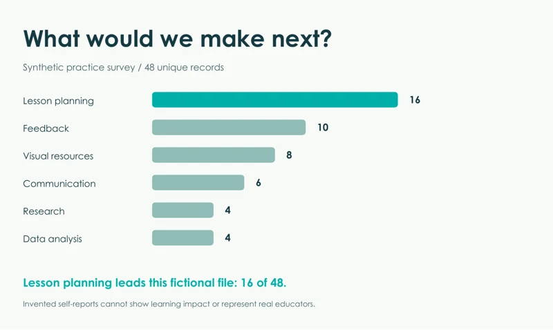
Finished example for comparison. Make your own version.
START HERE
Five steps to your first result
Open the workbook
Inspect Raw Survey and the codebook. CSV is included for tools that cannot read Excel.
Clean before designing
Paste the prompt. Request raw/unique counts, missing values and the cleaning log.
Check the fact sheet
Compare with Verified_Survey_Facts.pdf: 50 raw rows, 48 unique, 16 lesson-planning responses.
Create the visual
Make one infographic with category counts, n=48, a takeaway and a clear synthetic-data label.
Try a second medium
If time remains, upload the checked fact sheet to Gemini Notebook for a short audio or video overview.
Your starting prompt
Analyse the attached fictional survey using the codebook. Keep the raw data. Remove only exact duplicate rows and normalise the two documented category variants. Leave missing values missing. Return a cleaning log, valid denominators and a checked fact sheet before creating the visual. Then make one landscape infographic titled “What would we make next?” with category counts and n=48. Label the data synthetic. Use a clear bar chart, one supported takeaway and one limitation. Keep invented comments labelled fictional. Do not claim these responses represent real educators or establish learning impact. Create a downloadable visual if supported; otherwise provide a chart and a layout I can reuse.Download this prompt as TXT ↓
Media prompt
Use only the attached Verified Survey Facts as the data source. Create a short staff-facing Audio Overview, Video Overview or Infographic about the next tasks requested. State that this is a fictional practice survey with 48 unique records. Keep every count and denominator unchanged. Explain the leading category without claiming causation or generalising to Ontario educators. End with “Which result would you want to investigate next?”Download this prompt as TXT ↓
YOUR QUALITY CHECK
Does the result hold up?
Counts sum to 48. Missing numbers stay missing. Confidence change uses 46 complete pairs. Every chart label matches its fact sheet.
Take it a little further
Ask for a version aimed at a department head. Keep every number fixed. Change only hierarchy and explanation.
If your tool is slow or cannot export
Use the provided infographic and ask for a clearer layout. Check the supplied chart instead of waiting for image generation.